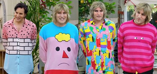
Welcome to my unofficial love letter to the branding of the clothing company Lazy Oaf in relation to the use of typography. Or, more formally, my blog about how the brand Lazy Oaf presents itself via typography in relation to its aesthetic and identity. Long have I been enamoured with the many conflicting elements of the brand’s aesthetic and how they work together so perfectly to represent its identity. The identity of the Lazy Oaf brand is something I have always connected with- self described as having a sense of “teen rebellion” and “warped sense of humour” which are two things I can certainly relate to. From their use of colours to their individual garments, Lazy Oaf are a very unique brand whose marque is firmly rooted in how they present themselves. I would confidently argue that the typography used on Lazy Oaf products is one of their key identifiers- so iconic that it is easily recognisable whether it be on a stranger in public or Noel Fielding on The Great British Bake Off.
I intend to go into much more detail on these key aspects of Lazy Oaf’s branding in various blog posts, which i hope will be interesting to people other than myself.